Saturday, October 22, 2016

100 Drawings Workshop-Monochrome Stripes

I just got home from spending an amazing week with 6 artist friends in a rented beach house. I did manage to do some of Jane's lesson while I was there and finished them up at home.

This is lesson 7. I know I haven't posted some, but I'll get back to them.

I hadn't intended to do the entire exercise in green, but that's what happened...and they definitely look like MY work!
The six lesson pieces are 9x9 and the two extra play pieces are 9x12 and 8 1/2 by 11.
I've always enjoyed working in a monochrome palette and this sent me down a new path. Usually my monochromatic pieces are exclusively collage. I like that some of my lines are a little wonky and decided to embrace it.
For all of the pieces I squirted out 6 greens and some white and mixed and matched on my palette.

1
I went for a minimum of variety in this piece, but still feel that it has enough juxtapositions of value contrast to make it interesting. The tiny value shift in the upper left keeps drawing my eye up.

2
In each piece I made a conscious effort to vary the width of my lines.

3

4
Numbers 3 and 4 have the widest range of hue from a light yellow-green to a light blue-green and the highest range of saturation between bright green and barely green.

5
 This is one of my favorites. The three little strips of collage keep drawing me in. I'm also loving the high contrast value shifts of the thin stripes in the middle.

6
Number 6 ended up with the most variety. The right top portion is more organic and creates a contrast with the hard lines in the lower left.

7
Ooops, that blue bit did not look blue until it was painted next to all of the greens. This experiment (#7) has more highly saturated colors on the bottom and muted colors on the top.

8
Number 8 came about while I was making collage papers and decided to go for subtle edges instead of hard edges just to see how it would look.

All in all, I had a similar reaction to this lesson as I did to the color lesson. At first I wasn't a huge fan of the stripes, but as I got into it I totally enjoyed creating just enough variety within those stripes to make them interesting.

Saturday, September 24, 2016

Still working through Jane Davies 100 Drawings Class

For seven of these I started with pieces created in lesson one so they all already had something going on to start. Why re-invent the wheel, right? They all have far more than three passes as I kept cycling through and reviewing variety. I kept asking "what does this have and what does it need?". I needed to scan these while they still showed variety of mark and line in all quadrants before I took them further......I'm dying to add color!
1
 I had fun getting a veiled effect with watered down black acrylic ink in the upper right. I also realize with this one that the opaque gray block provides a counterpoint to all of the veiling. I love it, but I am still struggling with commitment issues when it comes to opaque paint.

2
Adding the contrasting skinny white line over the solid black created some movement here. I tend to work middle of the road in value and scale so I tried extra hard to add skinny little lines and bigger shapes.The lower right and left were looking pretty similar so I added some black fine line shapes to the right.

3
I'm finding that after veiling and covering over a lot of marks, it is effective to pull selected marks back to the top. In this case, the black drips in the right lower corner were re-dripped after being obliterated. I guess this is all part of the process of recognizing what worked and knowing that I don't have to preserve every "favorite" mark because I can always re-introduce them back on top. I'm also getting better at going over existing marks to commit to them more.

4
Here in 4 and 5, I am committing to some big black shapes and then breaking them up with skinny contrasting lines. The hard edge of the veiling in the upper right and its contrast with the black is an effect that I need to remember to use again.

5


6
Super Busy! There is a lot going on here in 6, but I'm enjoying looking at the scan and searching for all of the different marks and depths.

7
 Seven is a little quieter and still has a variety of line, mark and shape in each quadrant.

8
I'm not sure what to say about 8. It does have variety in each quadrant, but I'm itching to take it further to define the areas I like the most (lower left).

This volume of practice coupled with being "forced" to work every week is helping to overcome that non-committal piece of me. As the Queen of Procrastination, I can't believe I've actually kept up with all of the lessons!

Friday, September 16, 2016

Lesson Three in Jane Davies 100 Drawings Class

I am loving this class so much that I'm chomping at the bit on Monday night knowing that I have to wait until Wednesday for the next lesson! Then Wednesday morning I managed to do a few minutes of painting before I head off to work.

I gave myself challenges as I worked through the shape exercises. Some are successful, some not so much. I'm totally okay with that though. It's all part of the process....and I haven't even pulled out the gelli plate yet!

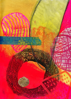
It all started out with a riot of color and shapes. #1 started out with the black circle that I had made with the gelli plate a while ago. Then I added the pink masked shape with a stencil over it. Next came orange marker, oil pastel, collage, graphite and a piece of painted tape.
1
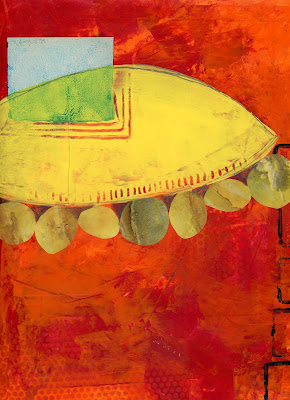
 Number two started over a previously painted orange background. Collage and free-hand painted orb. I was holding this the other way, but my husband insisted it was upside-down... :)
2
 After the riot of color I forced myself to try something more subdued. #3 has a negative space shape, collage and the pink circle is straight paint.
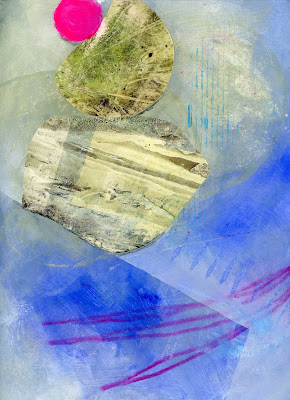
4
The yellow leaf shapes in #5 are negative space. I tried to not add too many different colors to this one.
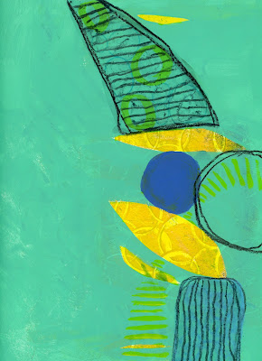
5
 At this point, I went back to re-read the lesson assignments and realized I needed to force myself to play with a neutral color palette. For #6 I tried to add a lot of shapes, but not a lot of color. It works....
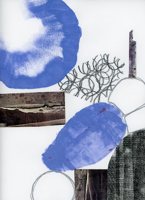
6
 Then I fell back into a bunch of color, but created the shapes differently.
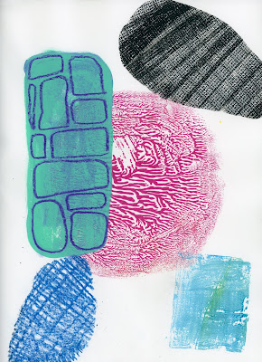
7


#8 is my true neutral and I love it! Collaged triangle of citr-solv'd National Geographic, a tea bag, and a piece of paper I created. Simple is so effective, but I have trouble stopping.
8

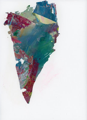
#9 is as simple as it gets...The shape was peeled off my palette. I don't want to add more and wreck it.
9

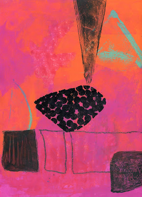
My personal challenge for #10 was to only add black shapes to the super colorful background.
10


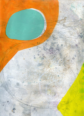
I thought I was done with #11 and had scanned it. It floated back to the top of the pile and I defined my big shape more. Then I realized it could use a contrast in shape size so I added the little collaged squares.
11-Before

11-After

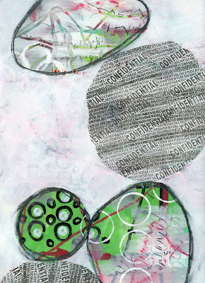
#12 is negative shapes and rolling security stamp through a stencil.
12


#13 has just three shapes in three different methods-Collage, ghost image pull from another piece, and a homemade foam stamp.
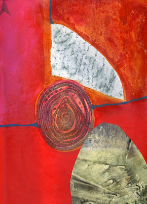
13


One of my final challenges was to use irregular shapes. It is something that I struggle with. Irregular shapes just seem wrong to me, but I like them in #14.
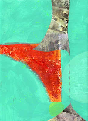
14

For #15, I worked a grid over a previously painted page and then created negative shapes. Squares are also not my go-to shape so I have to work extra hard to include them.
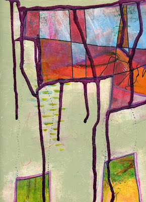
15

These last two are pieces that I developed to the point that I think they are finished pieces.
#16 feels very Seuss-ical to me, especially that critter arm reaching across the top.
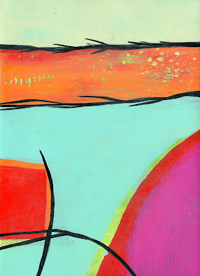
16
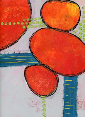
 After living with a house full of engineers for so long I find that floating shapes just need to be grounded.I love the tension of rocks just about to fall...
17
 I try keeping the challenge of varying the shapes in my head and trying new things on each piece. Creating so many pieces definitely gives me a chance to keep pushing.

How many days until the next lesson????

Thursday, September 8, 2016

A Painting Fool!

Thanks to Jane Davies' 100 Drawings on Cheap Paper class I have been covered in paint and having a fabulous time! Mind you, it is only week two, but so far I am keeping up with the lessons and postings. I may just have to give up my Queen of Procrastination Crown! Ever since Karen and I went to Jane's Big Fat Art Weekend back in April, I have painted with Jane's voice in my head guiding the way. She pushed me more than anyone else had in the past. I really should post some of those Big Fat Art pictures...another time...

For now, here are a few of my 100 Drawings. Lesson one was only about line and veiling. The whole idea was to create different kinds of lines then cover them up different amounts. These are all before and after shots. I don't think any are finished pieces, but that isn't the intention of the lesson.
1
 It was so hard to cover up lines that I liked, but Little Jane on my shoulder pushed me on...I'm so glad I kept going because I really like the result.
1.5

2
 This one somehow ended up with a bird on it... I love my security roller. It makes such a cool fat line.

2.5
 My favorite lines in 2.5 are the really skinny ones coming off the birds head.

3

3.5

4
 Asemic writing is one of my go-to lines.

4.5
 EKGs are my other go to line...love 'em!

5

5.5
This one ended up with a bluish tint, but I think it may just be the gray Neocolor II.

This is just the first 5 from Lesson One. I'll share more soon...

Sunday, May 31, 2015

The Importance of Playdates

What happens when a hoarder invites friends over to play? We each claim a teeny tiny spot on the table and get to work... I had good intentions of cleaning the studio so we would have vast amounts of room to work...didn't happen. Surprise, surprise....

I just spent the weekend with two of my favorite people doing some of my favorite things. Lynn and Karen made the trek from the far reaches of New England for an art sleepover.

Art playdates are amazing! We play off each other, offer constant inspiration( I want to be as deliberate and purposeful as Karen instead of just winging it all the time), advise, push, and laugh a lot. We also eat well---tomatoes, brie and herbs over pasta for dinner, roasted veggie panini for lunch, cheese, crackers, olives and prosciutto for snack. The other thing we do that just feels right and gives us time to re-charge is nap. That's right, grown women taking a timeout from being with each other and having some quiet time before regrouping for more art....Not only is it okay, but now seems perfectly normal in our group.

Since we are all in the witness protection program and do not allow photos...at least it seems that way :) , this is all I have to offer.
First a bit of Lynn. I would like to say that we made all of that mess together, but it all honesty it was there when she arrived.

These are Karen's masterpieces. She was only here for 24 hours, but created quite a few pieces!
Lynn's pieces are awesome too! It is so much fun to push someone and share all of my stuff.
I worked on a couple of the big canvases that were started at last years' WAAR (Wicked Awesome Artists Retreat). I had promised to finish all 8 of the 16x20 canvasses we started...Hmmm, With 2 done and another started, I'm not sure if I will get them done in time for WAAR 2015 (in October).
 Lynn hated this next one and was not afraid to tell me. On Saturday, we went to a printmakers show at the Duxbury Art Complex and I was inspired to add the purple cilia around each of the blobs. Now Lynn isn't so offended by it.... I'm trying to push myself more and make bold moves, not worrying about "wrecking" the piece.

 You've heard this before (from many places), but I strongly recommend getting together with other like-minded people to simply play! You will not regret it!

Monday, August 25, 2014

Painting at The Marshfield Fair

 
It's been a busy few weeks with The Marshfield Fair in full swing. I stepped up my volunteering just a bit this year. First we had a full weekend of checking-in all of the Country Arts entries (see the exhibitor handbook on the Fair website). While most of the entries come from local artists and craftspeople, the quilt block competition brings entries from far and wide. The amount of work involved in presenting the country arts display is amazing-from checking in the entries to judging, then displaying the 600 entries, then packing everything up after the fair.
I had an awesome time judging the cooking competitions with an old friend from high school. He understood that I got the big piece while we were judging chocolate bonbons because "I'm the girl..."
 
I met some wonderful new friends this year and I did THIS....


The Marshfield Fair Plein Air competition took place last Sunday. I wasn't originally going to enter, but was gently coerced (mmm hmmm) and I'm so glad I did it! ...AND I got a third place ribbon! There were 12 floral designers who competed first. They had 2 hours to use the flowers provided to create a gorgeous arrangement. Once they were done and judged (the man who won didn't even realize he was competing!) , the 12 painters were each assigned a display to paint. We had 4 hours to paint, right out in the open...with people watching... I was competing against another friend from high school (Class of 1985) so there was a bit of smack talk mixed in with support for all of the artists.
 
I was the only mixed media artist competing. The passers-by seemed to like all of my texture from collage under the paint, glass bead gel, and a tea bag. I should probably concentrate harder on editing myself... :)