Showing posts with label collage. Show all posts

Sunday, May 7, 2017

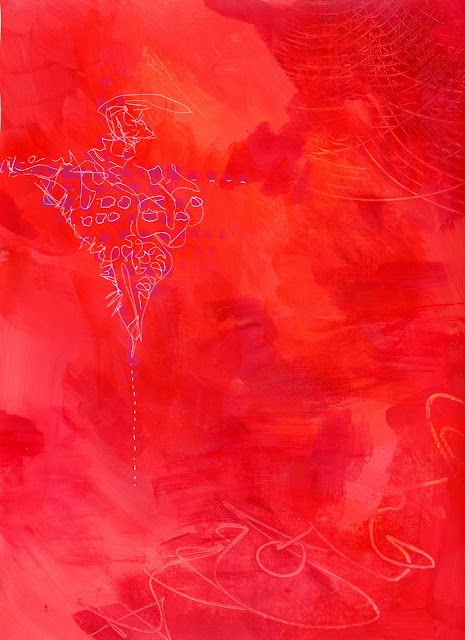
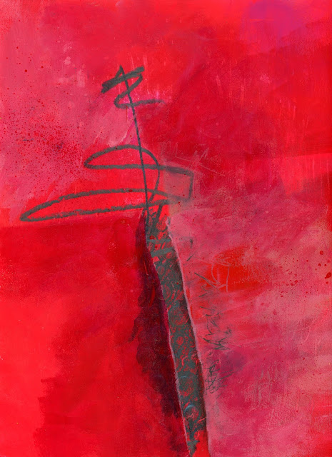
Evolution of a Painting-Seuss Tornado

I am just finishing up an intensive 12 week course with Nicholas Wilton. The class has been a roller-coaster between "I'm Awesome!" and "I suck. Why am I doing this?". Nick is a wonderful teacher, super-supportive and sharing. I was very hesitant to sign up back in February...It was NOT cheap...but I am so glad I did!

This painting has gone through so many iterations and may or may not be done. I thought I would share the journey...

The "Seuss Tornado" started out as thick swathes of paint on a 12x12 board.


The first layer had a ton of color. the second layer was an off-white.


I scratched back into the white layer and added tons of little details.


The white layer got a nice glaze to unify it and bring out the scratchy parts.


Now with such a beautiful background in place, I needed to define my shapes. 


I liked it at this point and thought it might be done, but the darks weren't defined enough and it was looking like timid paint application throughout. I glazed over the dark parts with blue to deepen them a bit and defined some opaque areas.


It was still to vague and I was missing areas of light light and dark dark so I went on a wild ride changing it up completely! Now it is "Seuss with a dark side". I didn't plan the monster...He just showed up... :)


Friday, December 2, 2016

Celebrating 10 Years of Fish Mailart

I can't believe that I've been making mailart for 10 years! Since fish have always figured prominently in my mailart I thought it would be fun to feature one fishy postcard from each of the past ten years. The one fan of my blog already knows this, but I went to school for Marine Biology and somehow ended up in an office instead of on the water. At least I can see the ocean from my office....

One of my very first postcards ever was this alluring gem from 2007
I loved sushi back in 2008 and I still love it now!
By 2009 I was playing with more painted backgrounds. This one has some paper napkin too.
 
In 2010, I did a little more dabbling with paint. I should probably try to paint some of these fish now that I've been painting longer and honed my skills. I remember being REALLY impressed with myself back when I made this.
 
I chose "Fish by the numbers" to represent 2011. Boy do I have a lot of ephemera...

Now I'm thinking that I really should use some more of my hoard of ephemera and make some more collaged cards like this beauty from 2012.
I did a bunch of teaching in 2013 and this postcard came about during an image transfer class.


In 2014, I was collecting wool sweaters in earnest and felting them. One of my many projects was this argyle flounder. he survived the mail just as you see him in the picture.

A nice simple altered vintage postcard for 2015. That reminds me, I have a pile of unused vintage postcards hanging around here somewhere.....

This postcard for 2016 is one of my favorites. I love taking lots of disparate pieces and melding them together. this one has an old plot plan, a cookbook bit, junk mail, scrapbook paper, and of course...fish!


I hope you enjoyed my walk down memory lane... Here's to 10 more years of Mailart!!


Tuesday, November 1, 2016

Jane's Class is Almost Over

Lesson nine revolved around monochrome painting with a little bit of something else. After only managing to do one painting from the last lesson I knew I needed to push and make sure I did this one. I don't find that I struggle a whole lot with the lessons once I actually sit down to do them...The issue is actually sitting down to paint!

These are all 9X12 except #1 which is a 5X7 postcard.
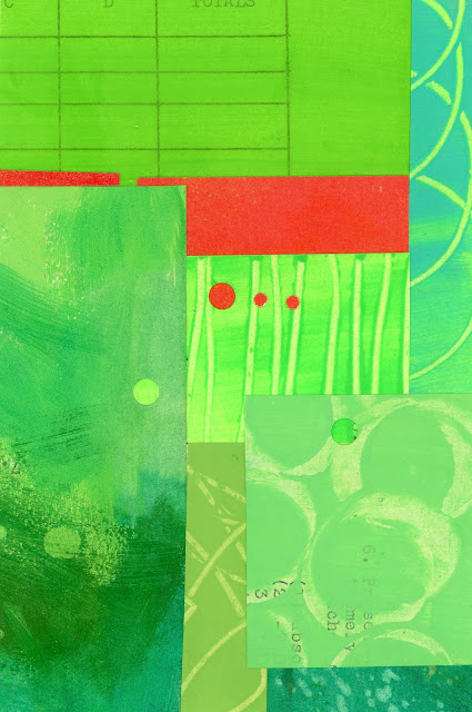
1
I knew that I wanted to try some collage with the mostly monochrome theme so I pulled out my extra painted papers from Lesson 7.  There is a lot of variety in the greens with hard collage edges being totally different from my paintings. The interesting thing that you can't really appreciate in the scan is that some of the dots are holes, while some are added on top.
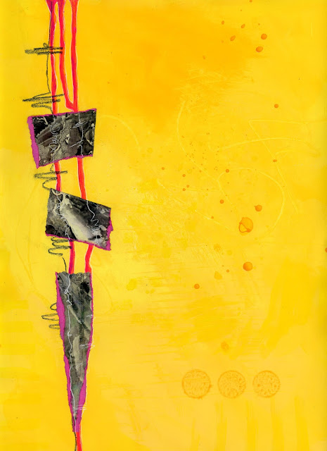
2
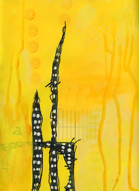
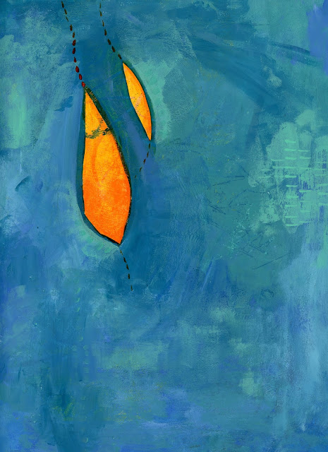
For 2 and 3, I decided to try yellow again because I find it so hard to get sufficient variation yellows.
In 2, I added the collage on top.
3
In 3, I started with the collage and painted around it. It is really hard to see in the scan, but I was happy with a subtle tone on tone in the upper right corner. I think I may take these further with some more orangey-yellows.

4
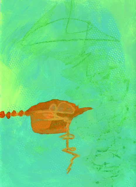
Number 4 also started with the "something else". I realize now that all of the paintings have very soft edges in the monochrome section.
5-before
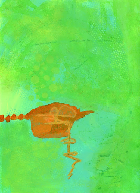
This one (5) felt like I was done, but got better as I added more transparent greens. I have to keep reminding myself that they almost always are better with more layers. I love the contrast of the orange and greeny-turquoise
5-after

6-before
I thought the #6-before picture was finished before I sat down to paint again tonight. As much as I really enjoyed the tiny white lines, the painting definitely benefited from the addition of more red layers and punching up the white lines.
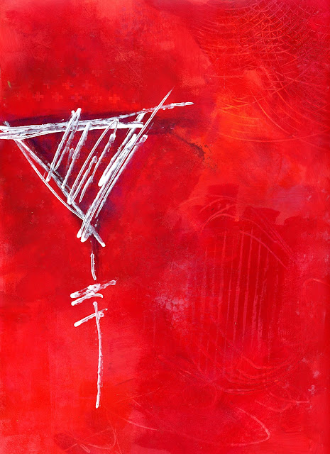
6-after
 It isn't easy to see in the scan, but there is a purple section under the white lines.
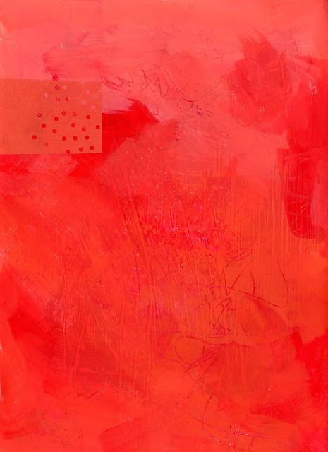
7-before
I wasn't sure where #7 was going because I was feeling attached to the one orange piece of collage. More layers and a weird shape...Now I think it works...
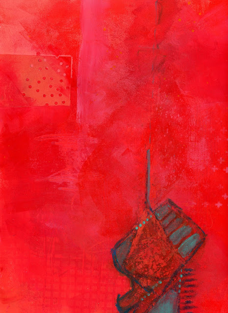
7-after
I just realized that some of my most successful pieces have value shifts that help define shapes. The pink swash defines the collage square in this one and the light blue shading in #4 highlights those pod shapes.
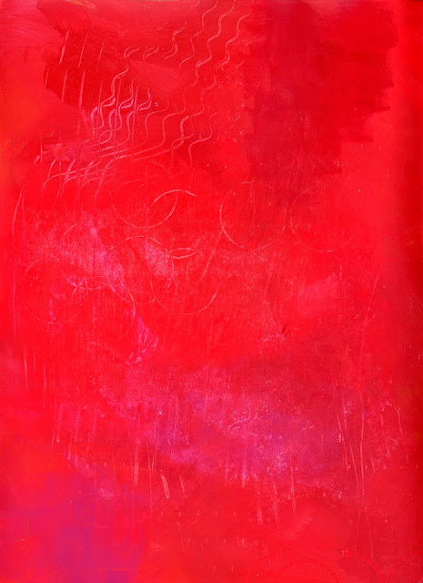
8-before

8-after
Exploring adding the "something else" in this one was so much fun. The "something else" started out as a blob of graphite scribbled over a stencil. As much as I love the shiny graphite, the layers created while painting over parts of it created great depth and textures. On the right I added many layers and scratched back into it while on the left I added fewer layers.
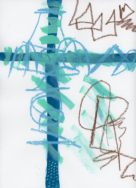
9-before

 #9 is probably the one I took the furthest from its starting point. I started with the something else and then pushed it pretty far (for me) with brown monochrome. The darker browns at "the crossroads" draw your eye up and then the dots echoed down at the bottom in both blue and beige add interest down there. This one is definitely my favorite of the lesson and makes me want to continue on and paint more!
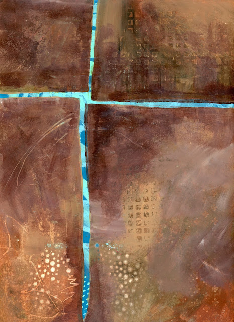
9-after
I enjoyed going down the Pinterest and Flickr rabbit holes and spending far too much time looking at art vs. creating. I need to set a time limit for looking vs.doing. This class has been awesome in actually giving the PUSH to paint. Thanks, Jane....

Monday, August 25, 2014

Painting at The Marshfield Fair

 
It's been a busy few weeks with The Marshfield Fair in full swing. I stepped up my volunteering just a bit this year. First we had a full weekend of checking-in all of the Country Arts entries (see the exhibitor handbook on the Fair website). While most of the entries come from local artists and craftspeople, the quilt block competition brings entries from far and wide. The amount of work involved in presenting the country arts display is amazing-from checking in the entries to judging, then displaying the 600 entries, then packing everything up after the fair.
I had an awesome time judging the cooking competitions with an old friend from high school. He understood that I got the big piece while we were judging chocolate bonbons because "I'm the girl..."
 
I met some wonderful new friends this year and I did THIS....


The Marshfield Fair Plein Air competition took place last Sunday. I wasn't originally going to enter, but was gently coerced (mmm hmmm) and I'm so glad I did it! ...AND I got a third place ribbon! There were 12 floral designers who competed first. They had 2 hours to use the flowers provided to create a gorgeous arrangement. Once they were done and judged (the man who won didn't even realize he was competing!) , the 12 painters were each assigned a display to paint. We had 4 hours to paint, right out in the open...with people watching... I was competing against another friend from high school (Class of 1985) so there was a bit of smack talk mixed in with support for all of the artists.
 
I was the only mixed media artist competing. The passers-by seemed to like all of my texture from collage under the paint, glass bead gel, and a tea bag. I should probably concentrate harder on editing myself... :)

Wednesday, May 28, 2014

Remember that Big Piece?

Well, I ended up starting another and slowly adding to the first. Once I added the birds I figured I was done, but I wasn't sure. I get stuck not wanting to cover up previous layers even though I KNOW it gets better as more layers get added.
Then I had a revelation! I wanted to play with negative space. I let that idea roll around in my head for a couple of weeks and then I just jumped in and did this!

I love it! And I thought it was done, but a week later I sanded down some of the red to expose more collage from underneath. I'm calling it "Two in The Bush".

As for the one with the arrow, it may or may not be done. They are both sitting on a bookshelf between the living room and kitchen so that they can speak to me when they are ready.


I'm temporarily calling this peice "Target Number".


What do you think???

Sunday, December 1, 2013

Going Large

I've been having conversations with other art friends about working large. We all agree that we want to, but really haven't. So I took a tiny dip in the working larger pool when I took a 16X20 canvas down to Jan's. I wasn't worried about wrecking a big canvas since I bought it for $1.00 at the thrift store...gotta love that place.

I started by covering the whole thing with collage bits (mostly book pages) and then added a wash of quin gold, quin crimson and thalo green. I bought some latex house paint samples at Lowe's (on clearance of course) to try the bubble effect that I showed in the provious post. After it was home and on display for a couple of days I started adding more paint. This picture was after I added some extra green, yellow and turquoise.


At this point, I didn't glue down the flask. It actually still isn't glued down while I work through deciding what to do. It sat like this for a day before I got brave and added some more paint. Sorry the pictures are crappy. I couldn't get a good shot without the flash back.
Next I added the orange..loved it.
Finally this is pretty much as it sits looking for the next layers. At this point I figure I've overdone and need to dial back. But no, I'm adding more layers of collage before I go in with more paint. This is the hard part...When is it done? When is it overdone?

Sunday, November 24, 2013

How to Be Creative

I saw this on Kelly Kilmer's blog and thought it was interesting.


I just had my third weekend of art play-dates and they all left me super-excited!
First there was a night at Karen's house where we made some postcards and chatted about a small girls' art retreat next September.

The next weekend Marissa came over here and we did a little "Mailart 101". Marissa created her very first mailart and we sent it off to MMSA.

Yesterday I went down to Jan's house and played with Carol and Jan. Even though we were all working on completely different projects we all would stop and admire the others and help push through obstacles.

I painted on a big canvas for a change. Here's just a peek... Art on All!!!


Monday, September 9, 2013

Can you say...Obsessed???


I have been playing with both Citra Solv and Nevr Dull a whole bunch lately in preparation for my class at Kept Creations in Whitman, MA on October 11. The pages below are all Citrasolv on National Geographic magazines. Aren't they amazing! You end up with a lot of lunar landscapes, but I'm okay with that.. :)  I'm home on vacation this week and am hoping to actually create some art while I clean the hoard. We'll see what actually gets done. So far it is 10:00 AM on Monday morning and I haven't done either one.

Enjoy the eye-candy. I'll post some finished pieces later.


 Isn't the green fabulous???!!!

 This one below was from an older Nat Geo (1970's) and it took quite a bit to mainpulate the inks, but it's still cool. I actually like my fingerprints all over it.

 The reds are wonderful too. Boiling hot lava...right?