Friday, December 2, 2016

Celebrating 10 Years of Fish Mailart

I can't believe that I've been making mailart for 10 years! Since fish have always figured prominently in my mailart I thought it would be fun to feature one fishy postcard from each of the past ten years. The one fan of my blog already knows this, but I went to school for Marine Biology and somehow ended up in an office instead of on the water. At least I can see the ocean from my office....

One of my very first postcards ever was this alluring gem from 2007
I loved sushi back in 2008 and I still love it now!
By 2009 I was playing with more painted backgrounds. This one has some paper napkin too.
 
In 2010, I did a little more dabbling with paint. I should probably try to paint some of these fish now that I've been painting longer and honed my skills. I remember being REALLY impressed with myself back when I made this.
 
I chose "Fish by the numbers" to represent 2011. Boy do I have a lot of ephemera...

Now I'm thinking that I really should use some more of my hoard of ephemera and make some more collaged cards like this beauty from 2012.
I did a bunch of teaching in 2013 and this postcard came about during an image transfer class.


In 2014, I was collecting wool sweaters in earnest and felting them. One of my many projects was this argyle flounder. he survived the mail just as you see him in the picture.

A nice simple altered vintage postcard for 2015. That reminds me, I have a pile of unused vintage postcards hanging around here somewhere.....

This postcard for 2016 is one of my favorites. I love taking lots of disparate pieces and melding them together. this one has an old plot plan, a cookbook bit, junk mail, scrapbook paper, and of course...fish!


I hope you enjoyed my walk down memory lane... Here's to 10 more years of Mailart!!


Friday, November 18, 2016

Lesson 6 in Jane Davies 100 Drawings Workshop


Lesson 6 was all about maximum variety and the goal was to have all 4 quadrants look completely different without actually dividing the paper into 4 parts and working them seperately.
This lesson was super fun for me. Besides the quadrant part, this is how I work anyway-lay something down, cover it up, repeat, add something else, cover it up, repeat...etc.
I am always keeping variety in mind with regards to scale and contrast.

For all of the pieces, I would put down an element and then be sure that the next element was different in some way, I also practiced bringing marks back up after I had mostly hidden them.

A bunch of these ended up being postcard backgrounds at WAAR (our Wicked Awesome Artists Retreat)


1

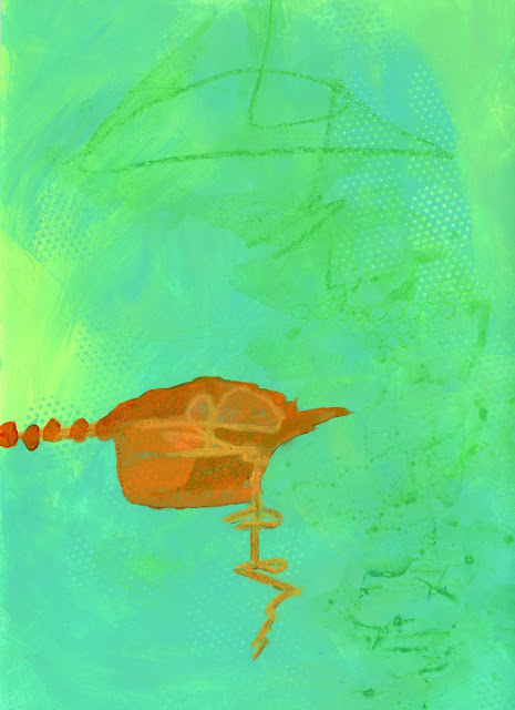
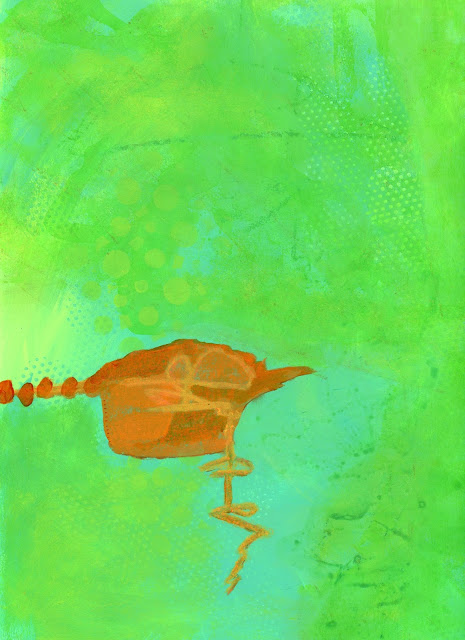
Number two was super pastel and bland when I picked it out of the pile of previous  rejects unfinished pieces. I was craving some brightness and contrast so out came the orange, yellow, and turquoise. The only issue that I found with this lesson is that a few of the pieces are a little quadrant-y. And the goldfish cracker was just a happy accident...

2


3


4
The colors in 4 are soothing with only the yellow and magenta providing some contrast.
5

6


7
Playing with opaque paints and transparent inks helped with the variety in #7.

I definitely had fun with this lesson and have plenty more pieces that are started. I'm pretty good at remembering to vary lines, but shapes sometimes lean toward sameness. It's hard to remember to vary ALL of the bits...

Thursday, November 17, 2016

Lesson 5 in Jane Davies 100 Drawings Workshop

This lesson was about color.

I must say that I didn't so much "struggle" as just not enjoy the first process of laying down areas of color. Laying down sections of color as a first step makes me uncomfortable. I always wonder whether I want hard edges or soft edges, high contrast or low contrast...etc. This time I ignored my thoughts (crazy as they may be) and really just put down paint to deal with later. That being said, once I started the mark making and emphasizing the color areas I loved this exercise!

I am disappointed that overall I did not get much variation in the yellow and will work on that in the future. The pinks and oranges, however show a wide range of hue and saturation.

1
I almost didn't post this one, but now that it is scanned, It feels successful. The dramatic difference in saturation of the 2 greens creates a great contrast. As I worked with aqua I realized that I have 4 shades that are almost the same. I added the light blue for some contrast. I almost never choose brown on purpose, but I'm glad I did. Even though it isn't fantastic here, having it on my palette made for some interesting paintings later.

2
In #2, the yellow is more saturated than the other colors and has almost no range in value. There are some marks in the yellow, but they are really subtle.

3
Starting with #3, I put yellow, magenta, and aqua down on my palette. It wasn't until I had used up all the paint that I realized they were essentially the primary colors!...just done my way.. --smile--
I played with hard and soft transitions here and I like having both in the same painting.

4


5
#5 is one of my favorites. The brown colored pencil made that stripe feel like a wooden log. The variations in the pink are wider in range, but there is a little more variation in the yellow than in other pieces.

6
In #6, I realized that I had been defining all of my color transitions with hard lines so I left some of the pink/blue transition undefined. I enjoy the low minimal value shift between the pink and blue coupled with the high contrast brown.

7
 #7 is an all-time favorite color combination with orange and aqua from across the color wheel. This has a lot going on in the large orange field that isn't all captured in the scan.

8
This one has some significant contrast between the red/pink areas and the orange/brown areas along with a wide range of values in the brown section.

9
The highly saturated chartreuse section makes me happy and I love it against the pink.

10
For #10, I decided to try a monochromatic color scheme and managed to capture many values and saturations of green. I always say that green is my favorite color, but I find it a challenge to paint with green.

11
In #11 I explored more gradual transitions. This was an end-of-the-palette clean-up with titan buff that became an analogous study through orange/red/magenta.

All in all, I found this a very successful exercise that made me look to create variety and contrast within my color choices.

Sunday, November 13, 2016

The Last Lesson in Jane Davies 100 Drawings Class

The final lesson in Jane's class was to create your own lesson.

Inspired by the map-like lines and grids seen here on Flickr , I challenged myself to explore lines and grids in a square format.

Parameters:
Paper size-9x9 or larger squares
Explore map-like grid-lines with layered opaque and transparent paints. It is okay to obscure parts of the "map".
Concentrate on rectangular/square shapes allowing for some "not quite square"shapes.

As I worked through my parameters I realized that square paper feels weird to me and 9x9 feels small. I will definitely take this lesson to larger paper in the future, but my house is torn up (new kitchen) and I barely had room to work on 9x9s...That being said, this lesson was soooo satisfying. I started with my squares that I set forth in the guidelines, but then realized that what I was craving from Anne-Laure's work was the super fine quality of some of the lines. Once I figured this out the lesson became more of a study of fine line work in grids and squares.

1
 This one was a very literal interpretation of my original intention. Starting with black was fun.

2
 The incised lines became my favorites and I explored the technique in all of the pieces.

3
 Number 3 has more map-like qualities. The dotted lines remind my of Billy's journey in the Family Circus cartoon.

4
 More incised lines that define the shapes within color blocks that do not have hard edges.

5
Getting my groove here in #5. I could probably stand to cover up the yellow/orange in the upper right corner some more...

6
Working with fine lines incised and drawn on top of layers.

7
 In my search for a thinner black line, I added thread to #7. This is definitely worth pursuing deeper.

8
Decided to try some of those super bright colors in #8. Pink under lime green makes such an awesome contrast! Love it!

9
 #9 was another start on black. After painting over with opaque salmon and transparent pyrrole orange I extended some of the lines that had been partially wiped out. It ended up to be a nod to Eric Carle's hungry hungry caterpillar~~smile~~.
 
10
When looking at my inspiration pieces again, I was taken by the hints of lines under a white over-painting so I figured out how to create the look for myself.

11
Did I manage to stick to my lesson? I think so...9X9?..check, map-like grid-lines?..check, opaque and transparent layers?...check, mostly squares?..check.

Do I think these are completed pieces? Nope, but I did learn a lot and had fun!

I am super proud of myself for actually doing most of this workshop (on time even...). I only missed completing one lesson and I'll go back to that one.

If you ever have the opportunity to take a workshop with Jane Davies, either in person or online--DO IT!

Tuesday, November 1, 2016

Jane's Class is Almost Over

Lesson nine revolved around monochrome painting with a little bit of something else. After only managing to do one painting from the last lesson I knew I needed to push and make sure I did this one. I don't find that I struggle a whole lot with the lessons once I actually sit down to do them...The issue is actually sitting down to paint!

These are all 9X12 except #1 which is a 5X7 postcard.

1
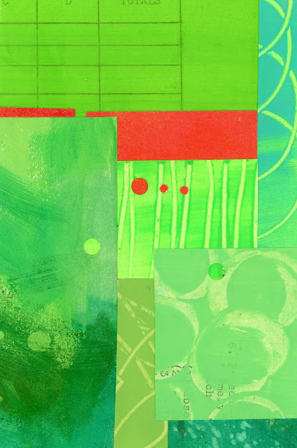
I knew that I wanted to try some collage with the mostly monochrome theme so I pulled out my extra painted papers from Lesson 7.  There is a lot of variety in the greens with hard collage edges being totally different from my paintings. The interesting thing that you can't really appreciate in the scan is that some of the dots are holes, while some are added on top.

2
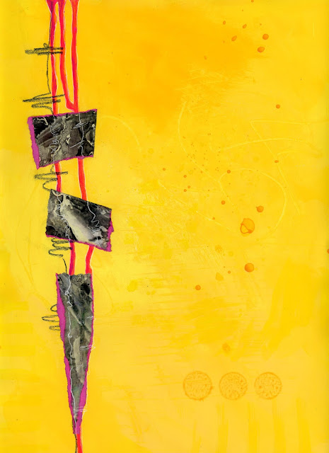
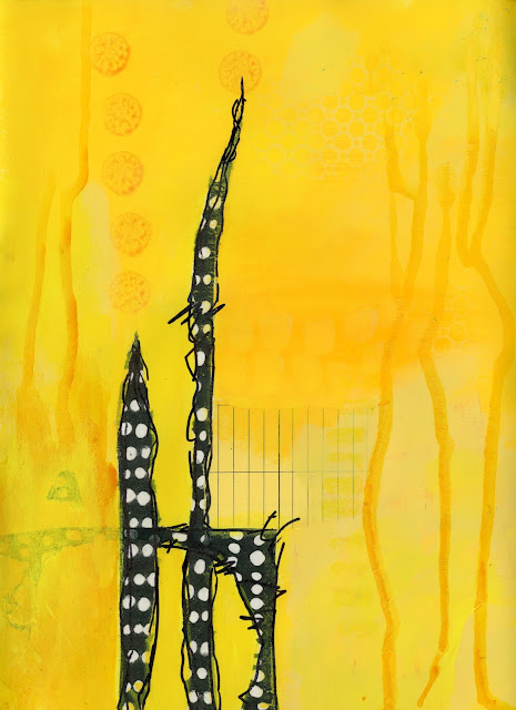
For 2 and 3, I decided to try yellow again because I find it so hard to get sufficient variation yellows.
In 2, I added the collage on top.

3
In 3, I started with the collage and painted around it. It is really hard to see in the scan, but I was happy with a subtle tone on tone in the upper right corner. I think I may take these further with some more orangey-yellows.


4
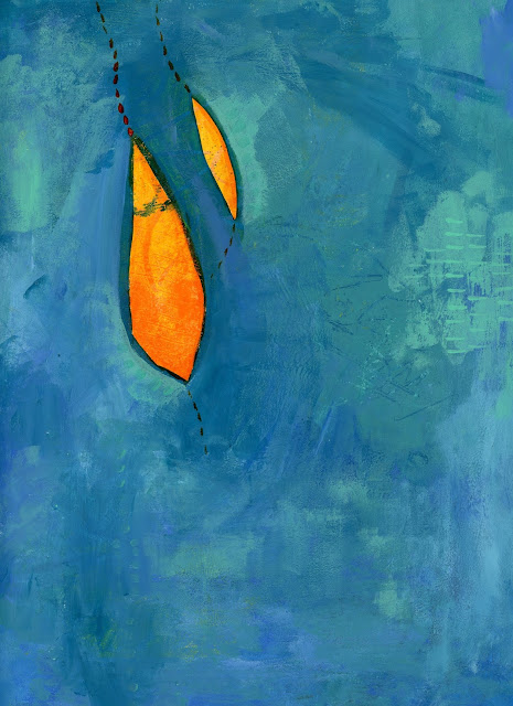
Number 4 also started with the "something else". I realize now that all of the paintings have very soft edges in the monochrome section.

5-before
This one (5) felt like I was done, but got better as I added more transparent greens. I have to keep reminding myself that they almost always are better with more layers. I love the contrast of the orange and greeny-turquoise

5-after

6-before
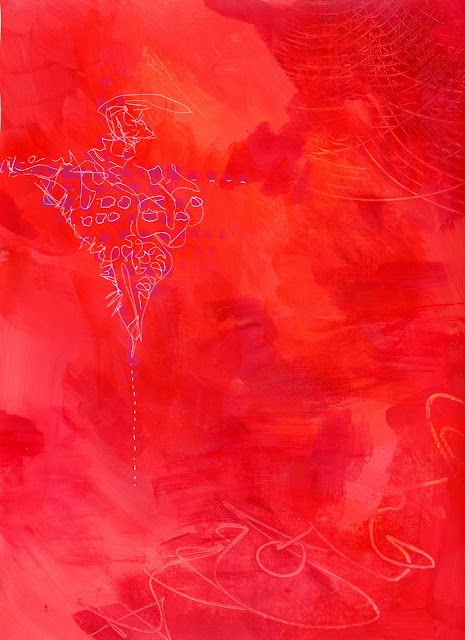
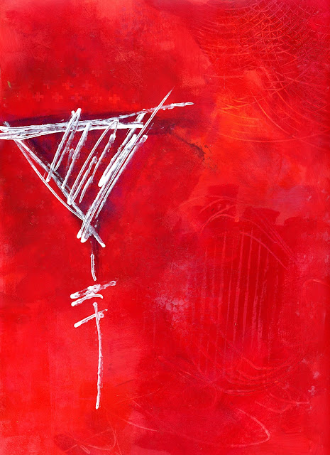
I thought the #6-before picture was finished before I sat down to paint again tonight. As much as I really enjoyed the tiny white lines, the painting definitely benefited from the addition of more red layers and punching up the white lines.

6-after
 It isn't easy to see in the scan, but there is a purple section under the white lines.

7-before
I wasn't sure where #7 was going because I was feeling attached to the one orange piece of collage. More layers and a weird shape...Now I think it works...

7-after
I just realized that some of my most successful pieces have value shifts that help define shapes. The pink swash defines the collage square in this one and the light blue shading in #4 highlights those pod shapes.

8-before

8-after
Exploring adding the "something else" in this one was so much fun. The "something else" started out as a blob of graphite scribbled over a stencil. As much as I love the shiny graphite, the layers created while painting over parts of it created great depth and textures. On the right I added many layers and scratched back into it while on the left I added fewer layers.

9-before

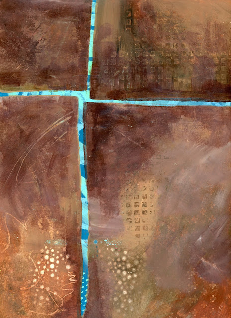
 #9 is probably the one I took the furthest from its starting point. I started with the something else and then pushed it pretty far (for me) with brown monochrome. The darker browns at "the crossroads" draw your eye up and then the dots echoed down at the bottom in both blue and beige add interest down there. This one is definitely my favorite of the lesson and makes me want to continue on and paint more!

9-after
I enjoyed going down the Pinterest and Flickr rabbit holes and spending far too much time looking at art vs. creating. I need to set a time limit for looking vs.doing. This class has been awesome in actually giving the PUSH to paint. Thanks, Jane....